
Bata Shoe

Integrations


challenges
Bata has a wide range of menu items with terms that may be alien to first-time users. The menu was lacking in the visual hierarchy, with little prominence on the search tool.
Overdose. conducted in-depth research on information architecture to improve the organisation of the menu into 3 tiers. We introduced icons to give context to first-time users on categories. To maximise the use of the mega-menu, we've also introduced retail space for Bata to promote campaign/promo banners. The search tool is the 'go-to' first step for users when visiting the site hence we've decided to give it prominence as part of the main navigation.
Bata's homepage was lacking structure in product discovery. Being one of the pioneer shoe brands, Bata was not utilising content to empower their SEO.
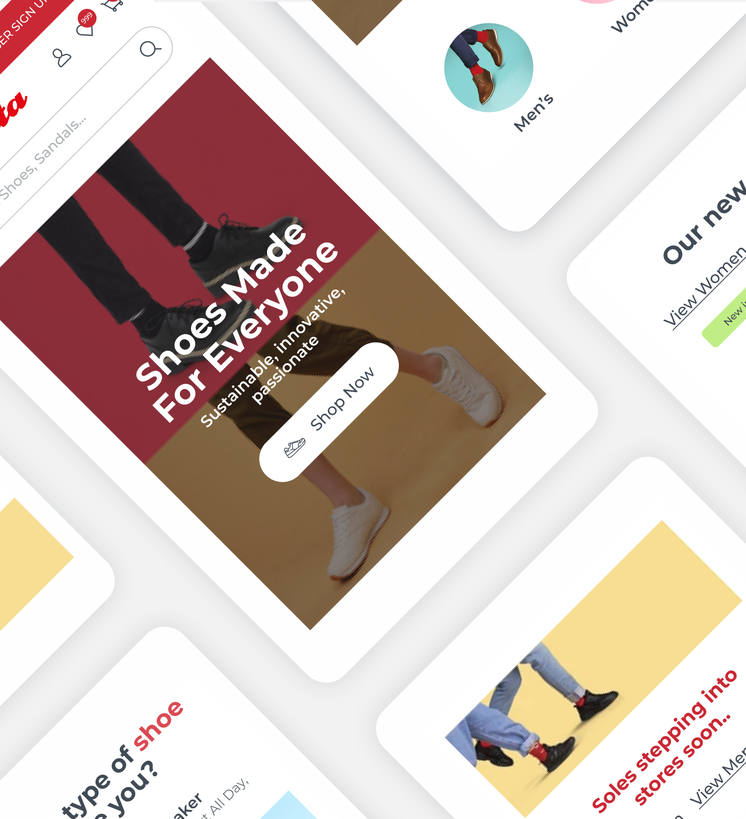
Overdose. conducted an in-depth ideation piece to learn about how users are browsing throughout the site and the pain points that contributed to a bad experience. It was important how we provide an experience that is uncluttered while keeping the essence of the brand as part of the experience. We introduced an easier way for users to discover products on the homepage with custom modules to introduce new arrivals and best sellers. It was also important to quickly introduce different profiles in the browsing experience 'Men', 'Women' and 'Kids' as these are the major categories that users are browsing in reference to the products. Blog content was strategically placed throughout the user experience to serve SEO as well as to help position Bata as a knowledge hub.
Bata has a wide range of products with different variants at affordable prices. Users tend to make bulk purchases but directing the users to the product page to select a variant is a missed opportunity to increase basket size.
We introduced a quick view for users to select a variant and size without having to leave the category page. There is also the filter function that helps users to trim down their search results to encourage conversions. Each category page starts with a concise, and SEO-verified description that talks about the types of products included. We've introduced stickers to communicate to users 'Sale' and 'New Arrivals' to users. To help with avoiding scrolling paralysis, we've introduced content blocks to help break the grid which acts as a retail space for Bata to shout out about campaigns and promos.
The search function that Bata had was not being utilised to its full potential. Users were being led to a dead end if there were no results that were matching their query.
We've utilised Boost Commerce to empower the search. We customised the ‘Search’ section of Boost Commerce’s app and adjusted the layout into a two-column grid, to serve users who are now with suggested products and to add personalisation to the experience, the other column was utilised to display recently viewed products. This helps users to find the products they'd previously visited and prompt them to purchase. We've also made sure that if a user query leads to a 'No Results' page, they are provided other avenues of re-entering the journey through recommended products.

- Bata Shoe Singapore & Philippines
Insights

UX/UI
We collaborated with the Bata team during the design phase of the project to solve customer challenges. We considered how to provide a guided user journey for easy product discovery, smart search implementation and user acquisition.
We prioritise in understanding how users browse the different categories, utilisation of filters and how we educate them on the wide product ranges. For a household brand with heritage values, it is important to weave in the brand story as part of the user journey. This can be seen in the utilisation of the brand colour, the Bata red, strategically in the interface. We also want to empower Bata as a knowledge hub hence the introduction of content as part of the product details page for education and brand trust. The utilisation of content in different parts of the website is also a creative way to talk about the different brands that Bata own in their inventory.
The introduction of the quick view allows users to quickly add products to their cart without leaving the category page; an important feature for Bata for easy shopping. Another focus point was the communication of product benefits on the product details page. As the previous website had little or no description of product benefits, we introduced icons to communicate key benefits to users to encourage conversions.
