Helping more people move from disposable to reusable, with a clearer route through KeepCup's products and purchasing options.
UX/UI & CROConversion OptimisationCustomer Journey MappingStrategy
KeepCup

Customer feedback and an expanding range exposed new demands on KeepCup's website. The brief was to simplify the experience, explain the products more clearly and serve both B2C and B2B audiences without losing the brand's sustainability focus.
The project
KeepCup was founded to encourage a shift from disposable coffee cups to reuse. As the business and its product range expanded internationally, its online platform needed to reflect a wider set of customer needs.
Overdose worked with KeepCup on product merchandising, audience-specific user journeys and customer education. The collaboration focused on making a complex offer easier to navigate while keeping the brand's environmental values visible in the experience.
Scope
- UX/UI & CRO
- Conversion Optimisation
- Customer Journey Mapping
- Strategy
- Platform Implementation
- Systems Architecture (Strategy)
- Audience Intelligence
Platforms & integrations
The shared platform records behind this case study.
Integration
Platform
Adobe Commerce
Platform / integration
Challenges & solutions
Swipe to explore all three
Experience
UX & UI
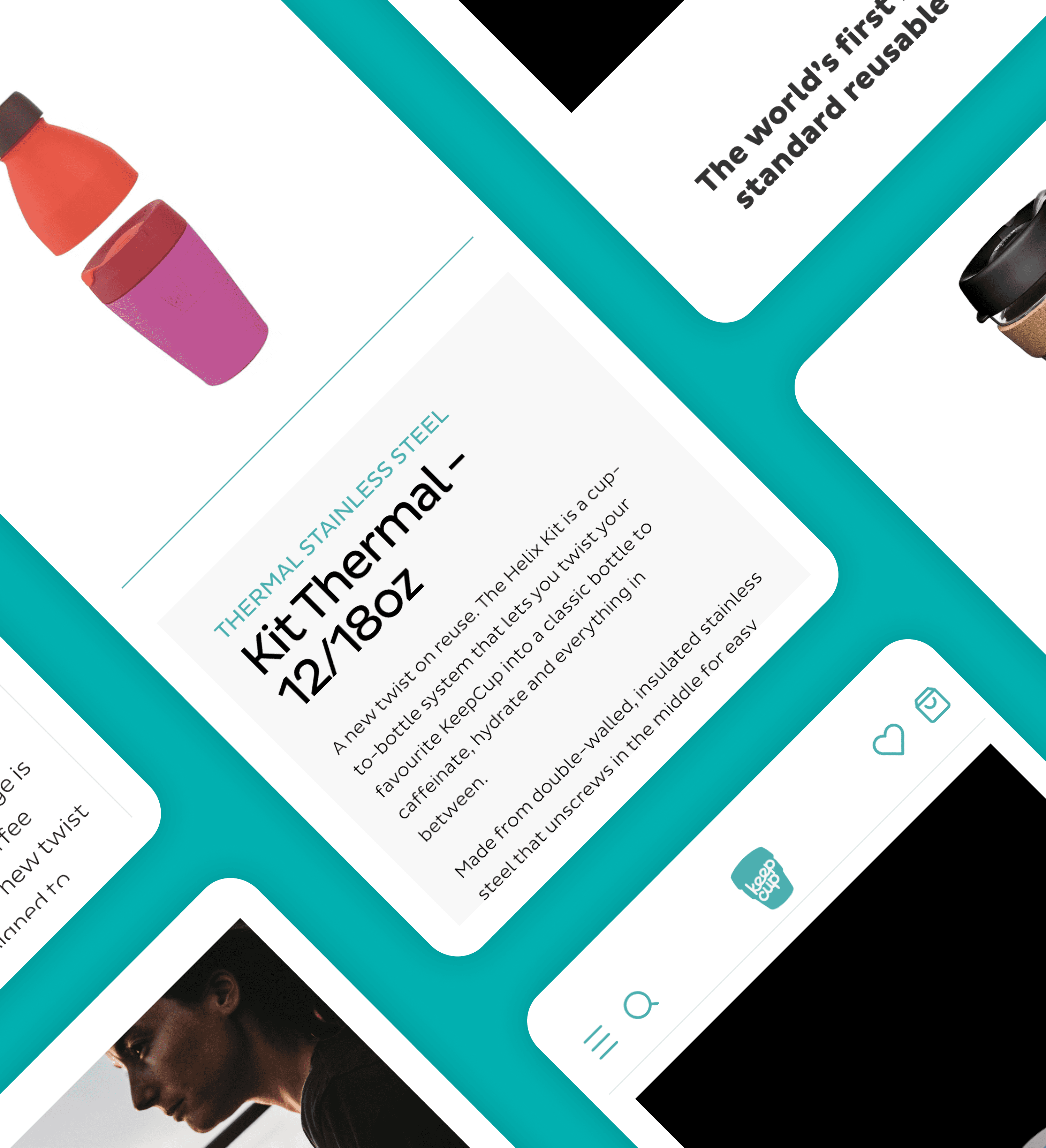
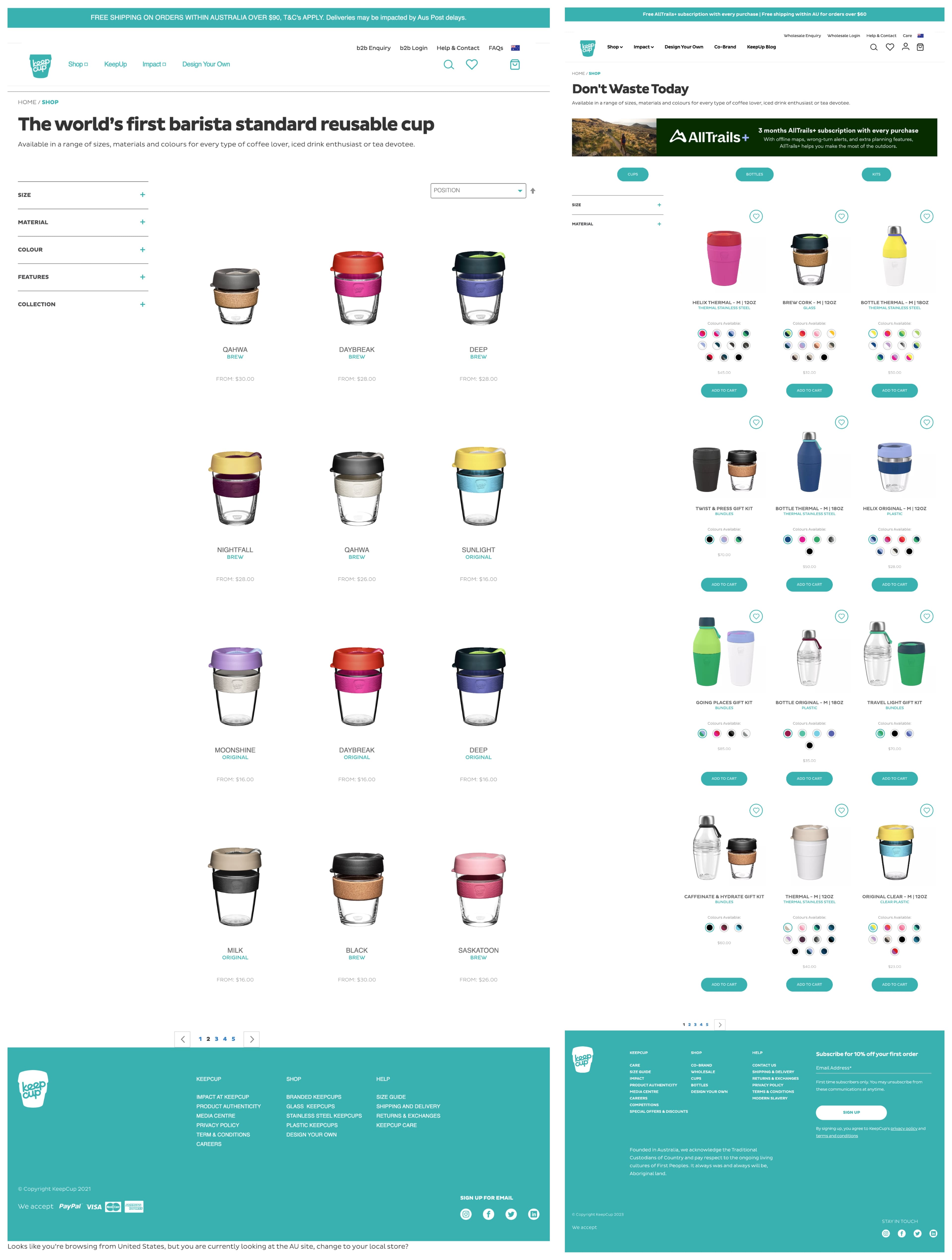
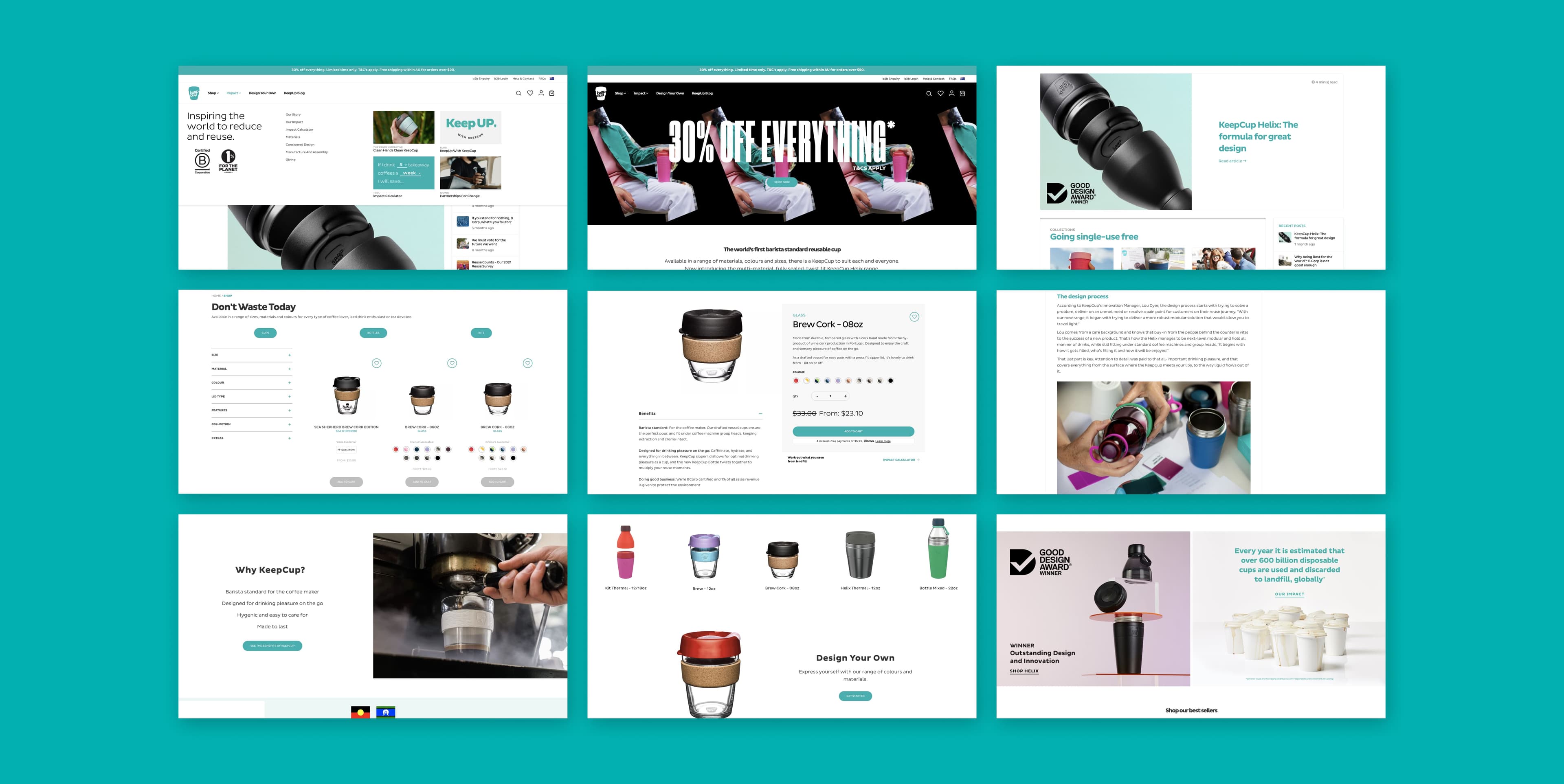
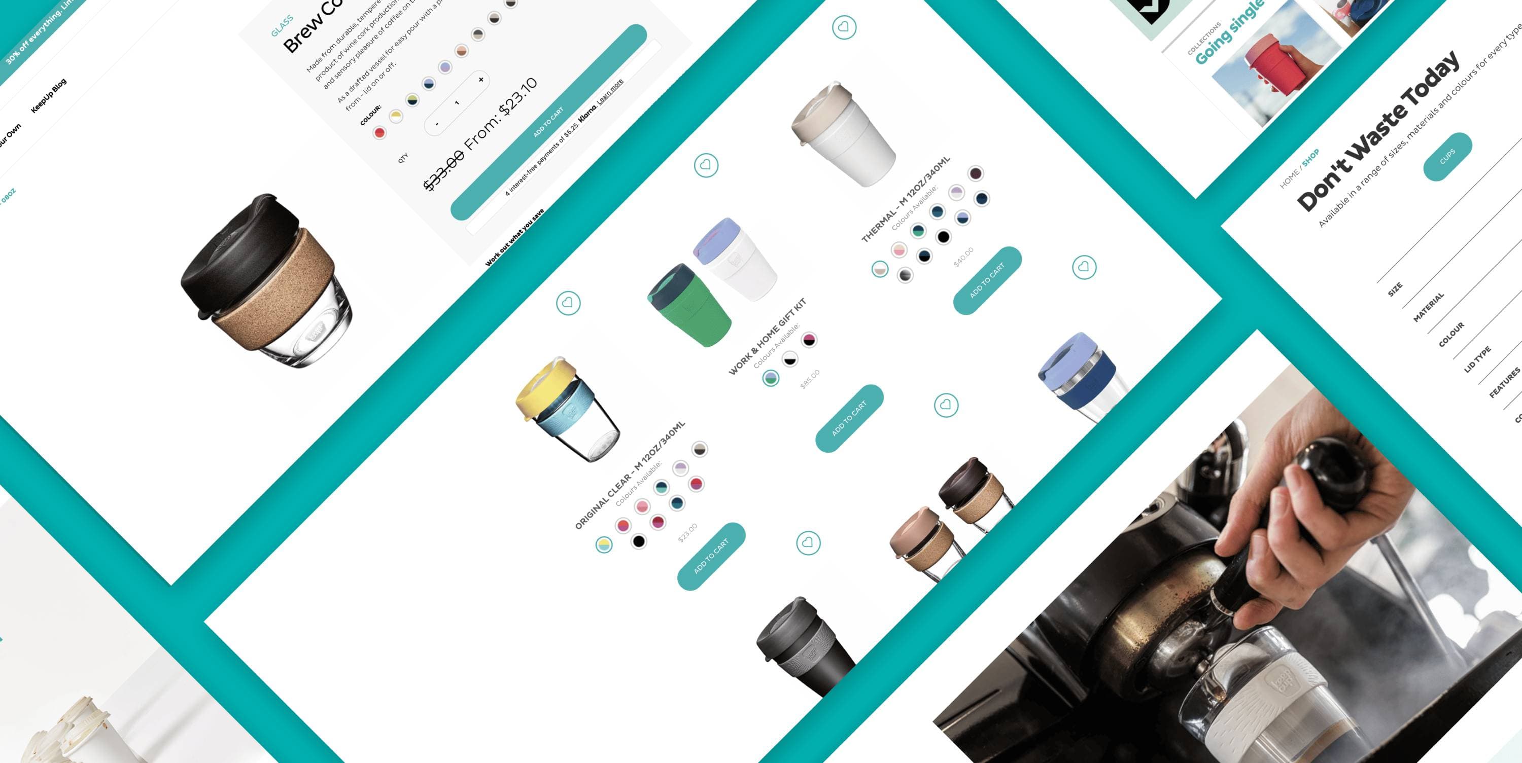
A Journey Towards Enhanced User Experience: Collaborating with KeepCup Our partnership with KeepCup was built on a shared commitment to refining the shopping experience across their B2C and B2B platforms. Recognising the complexities of their product range, we set out to streamline the journey for customers, making it easier to navigate and make informed choices. One of the most significant improvements we introduced was a shift from organising products by colour to arranging them by size. This transformation empowers users to select their desired size upfront and effortlessly compare available colour options through intuitive swatches. For consistency, we extended this enhancement to KeepCup’s B2B site, maintaining a seamless experience. Additionally, we implemented pagination on category pages, replacing infinite scrolling to alleviate any potential user fatigue when navigating lengthy product lists. Project Highlights: Redesigning B2C PDP and B2B List View + PDP across multiple regions. Displaying colour swatches outside dropdown menus.Enhancing B2B list view with swatches.Out of Scope: B2C category page changes (handled separately).Redirects or content updates (with KeepCup’s support).Size configuration (addressed as needed with related products).Our work aimed to resolve several challenges faced by KeepCup’s old website. These issues included navigating a diverse product range, differentiating products effectively, and optimising mobile user experiences. Additionally, we tackled merchandising difficulties, streamlined the sale pricing display, and sought to enhance the presentation of product features and benefits.

Client love.

“The work on our product reconfiguration has significantly enhanced how our customers interact with our offerings by minimising friction and presenting our range, sizes, and colours more clearly. Collaborating with Overdose. was a pleasure, as we discovered a solution that benefited both our customers and our internal team, streamlining product management and presentation processes.”

Kela Richardson,
eCommerce Coordinator

More work
- Adobe CommerceUX/UI & CROAmberAn Adobe Commerce build for Amber, combining postcode-based regional pricing, franchise-specific storefronts, editable content and a broader choice of Stripe payment methods.
- Adobe CommerceUX/UI & CROGlobeWestAn Adobe Commerce rebuild for GlobeWest, supporting trade relationships and consumer discovery through designer referrals, shared mood boards, quoting and tailored furniture freight calculations.
- Adobe CommerceUX/UI & CROJames LaneAn Adobe Commerce website for James Lane, bringing furniture variants, tailored shipping, customer reviews and payment options into a shopping experience designed around its catalogue.
- Adobe CommerceUX/UI & CROSistemaAn Adobe Commerce product-discovery platform for Sistema, supporting localised content, clearer storage categories and stockist information without making the website a transactional store.
- Shopify PlusUX/UI & CROKings SeedsA Shopify website for Kings Seeds, followed by SEO and paid-media support that connected its gardening range with new growers and seasonal purchasing needs.
- UX/UI & CRORJ LivingA Shopify Plus website for RJ Living, combining in-home AR product visualisation, flexible furniture pages and shipping logic tailored to bulky products and delivery locations.