Making a highly specific contact-lens order easier to place online, from different requirements for each eye to the promotions applied at checkout.
UX/UI & CROCustomer Journey MappingData Driven UX & UISEO
TA-TO.com
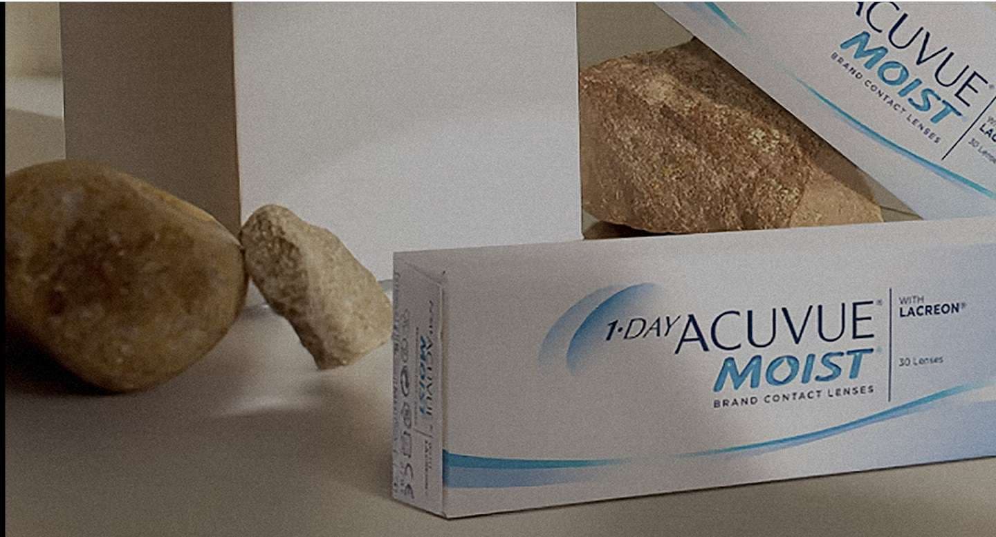
TA-TO.com's custom platform had to give way without losing the detail needed to order and fulfil contact lenses accurately. The migration also presented an opportunity to simplify URLs, improve product discovery and organise complex discount rules.
The project
TA-TO.com is a Thai contact-lens retailer founded in 2001. Overdose Asia began with discovery and design before delivering a Shopify Plus website that launched in May 2023.
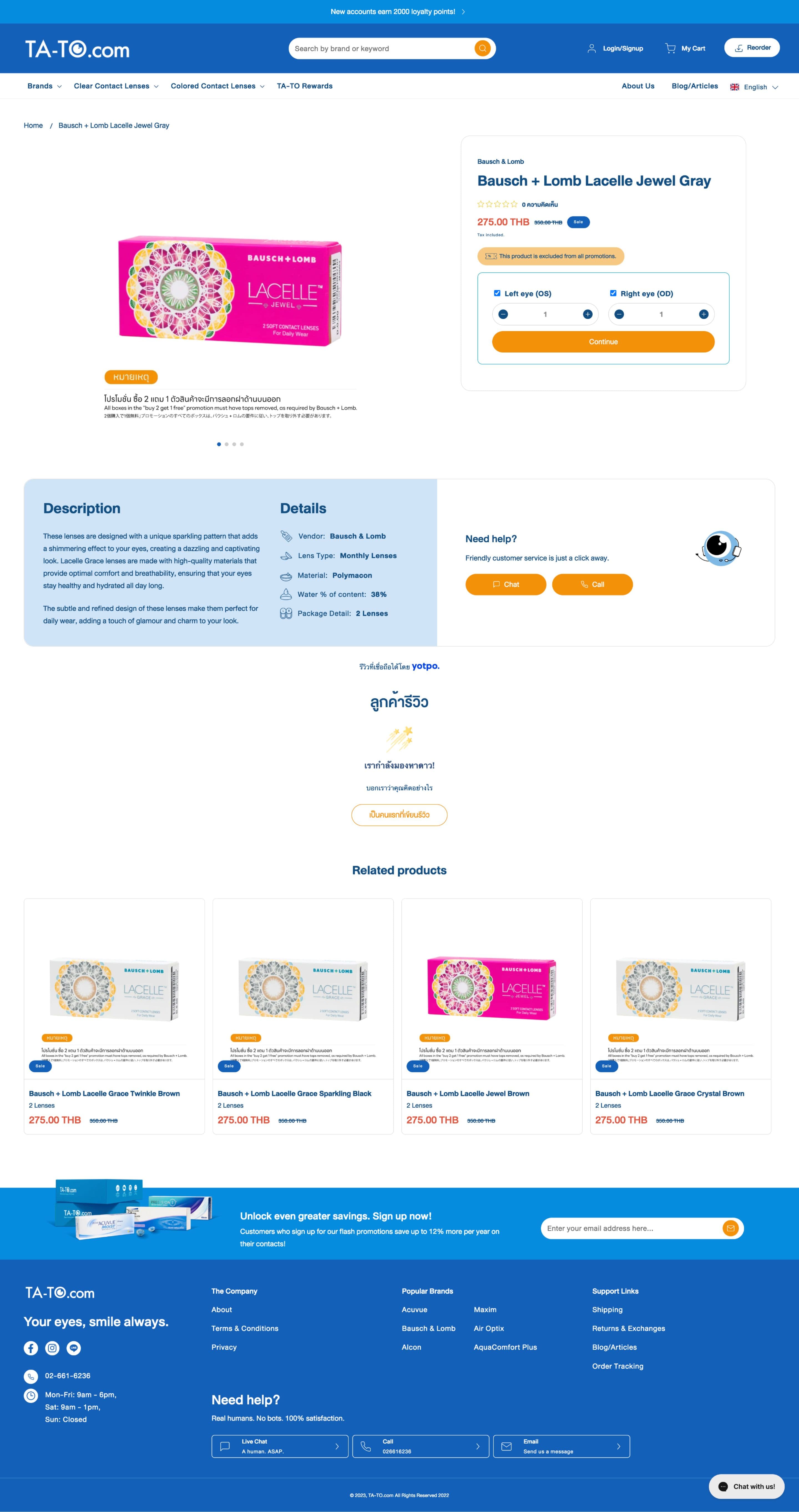
Custom product fields accommodated lens attributes and orders with different left- and right-eye requirements. The project also addressed ERP data, redirects, category research and promotion mechanics, helping move more of the ordering journey from phone-based service to the website.
Scope
- UX/UI & CRO
- Customer Journey Mapping
- Data Driven UX & UI
- SEO
- SEO Migration
- Technical Optimisation
- Strategy
- Digital Transformation
- Systems Architecture (Strategy)
Connected systems
Integrations
TA-TO.com has achieved remarkable results with Gorgias, boasting an impressive 4.8 out of 5 customer satisfaction rating. This achievement is attributed to their swift ticket resolution time of under 3 hours, placing them in the top 10% of Gorgias users. Notably, TA-TO.com's first response time of 3 minutes far surpasses the average of 1 hour for the top 10% of businesses on Gorgias. By prioritising quick responses and efficient issue resolution, TA-TO.com has effectively utilised tools like Gorgias to enhance customer lifetime value, foster loyalty and cultivate a community of dedicated fans, not just users.
Platforms & integrations
The shared platform records behind this case study.
Integration
Platform
Digital Marketing
Platform / integration
Swipe to explore all four
Results
- Increased eCommerce Revenue+18.75% Increased Total Revenue-…
- +103%
Experience
UX & UI
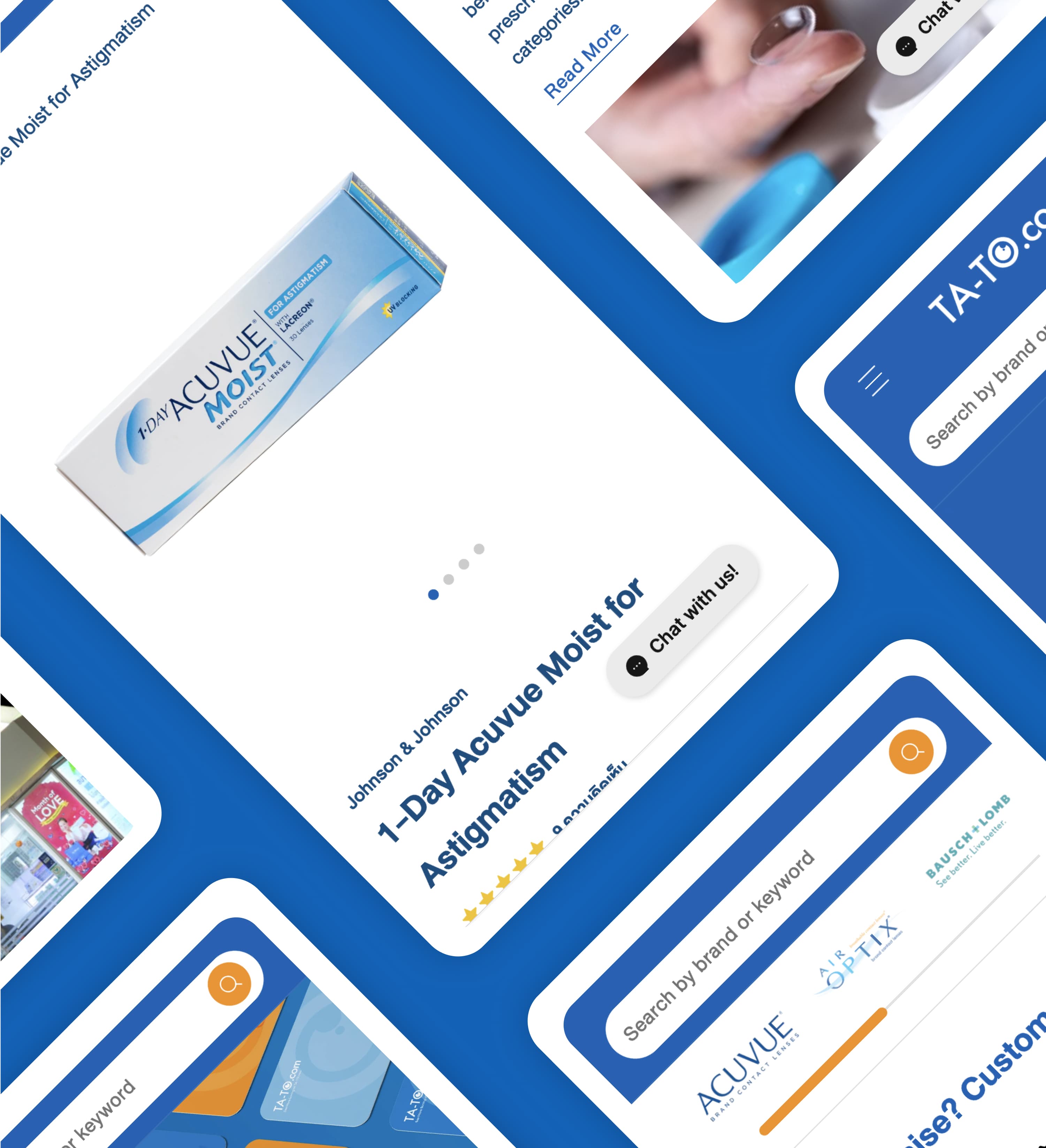
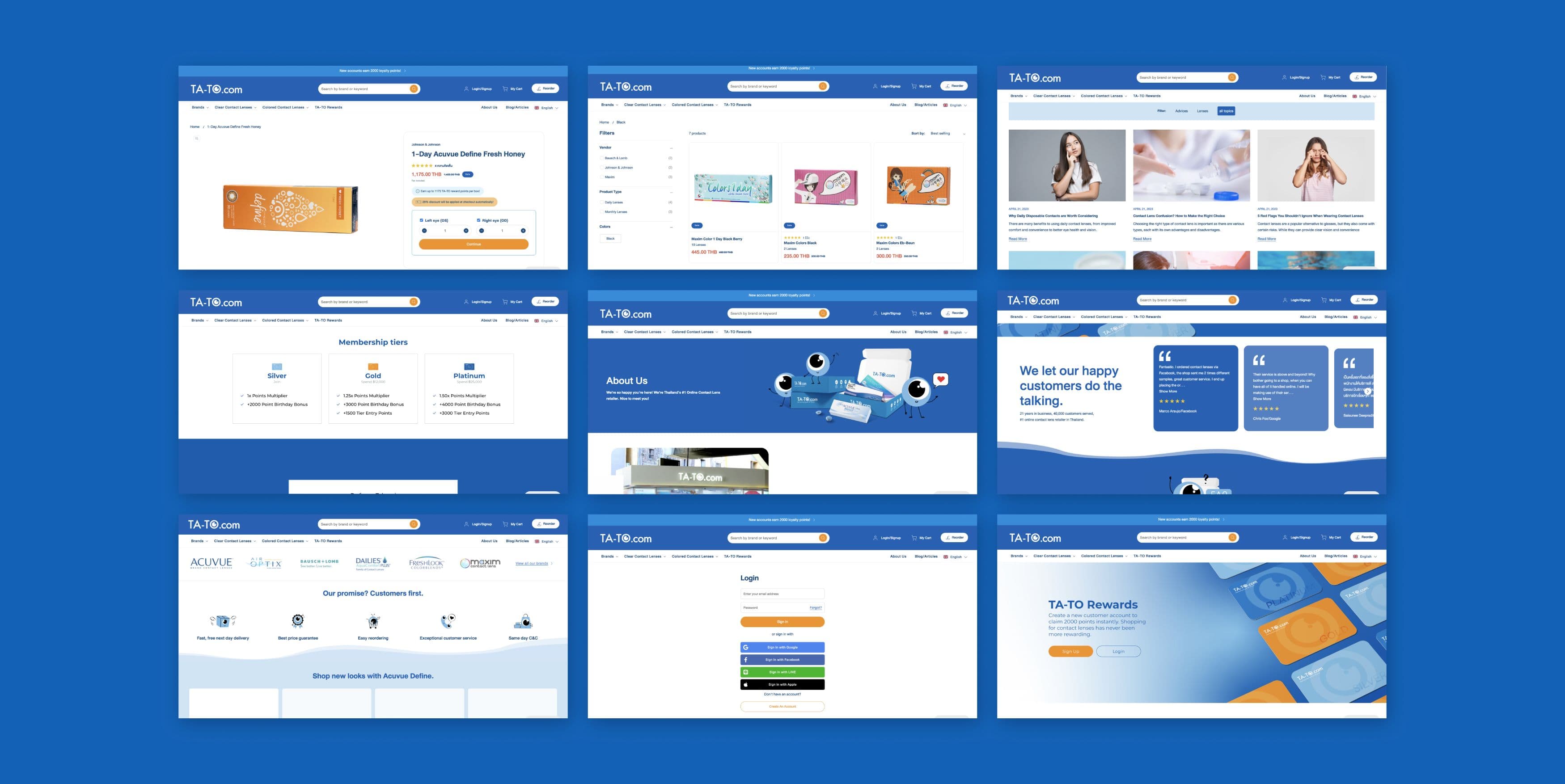
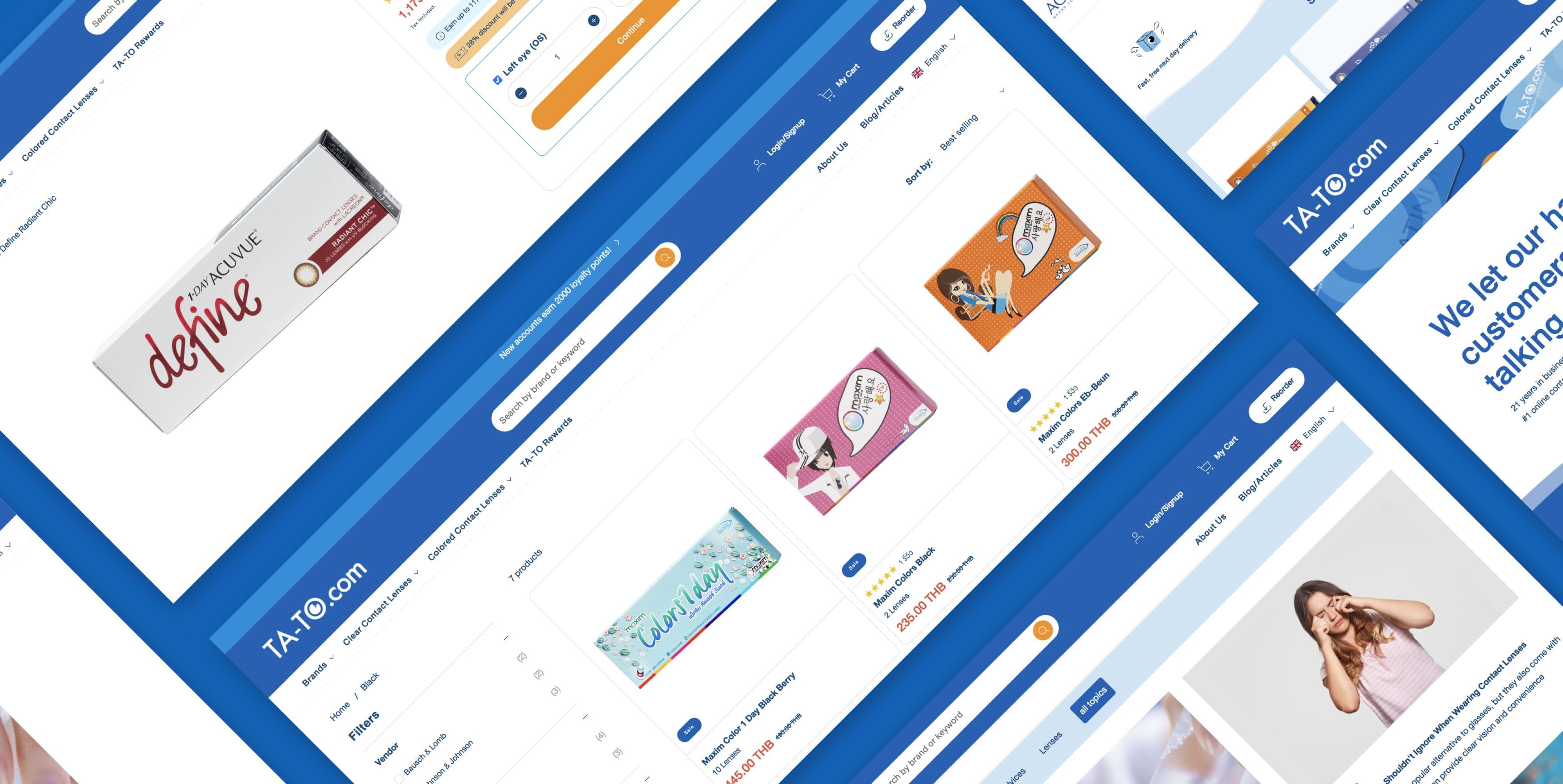
Overdose. had a unique opportunity to elevate TA-TO.com’s brand experience, transforming it into a benchmark for e-commerce excellence in Thailand’s contact lens industry. Our primary challenge was integrating a sophisticated, user-centric design that seamlessly merges aesthetic appeal with functional efficiency. By leveraging modern design principles, we created an intuitive and engaging interface that enhances product discovery and simplifies the purchasing process. Sophisticated, User-Centric Design:We implemented a clean, organised layout with a minimalistic design, making it easy for users to navigate different sections. TA-TO.com’s diverse categories are well-organised with clear labels for various types of contact lenses, including daily, bi-weekly, monthly, coloured, and speciality lenses. Intuitive Navigation:The main navigation menu is designed to be intuitive, allowing users to quickly find products by brand or lens type. Quick links to popular categories and best-sellers are prominently featured on the homepage. Overdose. collaborated closely with TA-TO.com, leveraging data to optimise the product discovery journey on the homepage. Comprehensive Product Pages:The product page was one of the most significant challenges due to the multiple variant combinations for each SKU. Each product page provides comprehensive details about the lenses, including descriptions, specifications, and user reviews, helping customers make informed purchasing decisions. The customer-centric purchasing journey guides users through various lens selection combinations and encourages membership, offering benefits such as faster purchasing and better product offerings due to stored prescriptions. Mobile Responsiveness:A major leap in UI/UX is the site’s mobile responsiveness, ensuring a seamless experience across different devices. This is crucial for the Thai market, where nearly 80% of users prefer to shop on smartphones. User reviews and testimonials are prominently displayed, providing social proof and building trust with potential customers. Easily accessible customer support options, including chat and call buttons, ensure users can get assistance whenever needed. Enhanced User Experience:Overall, the UI/UX of TA-TO.com focuses on simplicity, ease of use, and providing a smooth shopping experience from browsing to purchasing. This comprehensive approach ensures a seamless, enjoyable experience that meets the needs of TA-TO.com’s diverse customer base.
Client love.

“Our agency search lasted four months, during which time we interviewed and entered late-stage proposals with top agencies in Vietnam, Hong Kong, and Singapore. Furthermore, our path to Shopify Plus wasn't linear; we heavily considered alternatives such as Elastic Path (headless) and BigCommerce. We chose Overdose. because they packaged a vision for our e-commerce, not simply the required re-platforming. They built a comprehensive, multi-stage implementation tailored to our needs, including marketing automation, analytics, SEO, and power tools to propel customer acquisition and retention.What impressed me most about Overdose was the people. They're genuine, honest, and care about your success. They match your energy and passion for the build. Shared ownership fuels collaboration, idea vetting, and a commitment to delivering the final build on time and within budget. Their management team is elite, and they freely share their input and knowledge. Overdose. is an experience and an education, and I recommend their services for ambitious businesses of all sizes looking to build, grow, and dominate their e-commerce market.”
TA-TO.com

More work
- UX/UI & CROManage My HealthA health marketplace for Manage My Health, connecting Shopify Plus and Marketplacer with supporting search, communications and advertising tools through a discovery-led architecture.
- Shopify PlusUX/UI & CROBata ShoeBata Singapore moved to Shopify Plus and made its footwear range easier to navigate, search and shop across desktop and mobile.
- UX/UI & CROCULTIVERShopify Plus improvements for CULTIVER, with flexible linen bundles, variant-specific content and shoppable inspiration designed around how customers choose and combine products.
- UX/UI & CRODMD Skin SciencesA Shopify Plus upgrade for DMD Skin Sciences, connecting consultation bookings, prescription purchasing and customer accounts with improvements to search, address entry and loyalty.
- UX/UI & CROFossilA Meta campaign and Conversion Lift study for Fossil, examining how paid social influences search activity and sales beyond the immediate ad click.
- UX/UI & CROGlue StoreA Shopify Plus migration for Glue Store, connecting multi-brand inventory and store fulfilment with search optimisation and a more balanced approach to paid-media trading.